Voting finished, please see DebConf18/Artwork for the winning artwork.
[edit] Requirements
[edit] Process
- Initial Proposal: - Jun 1 0:00 (UTC+8)
- Revised Proposal: Jun 1 0:00 – Jun 13 0:00 (UTC+8)
- Poll: Jun 13 0:00 - Jun 18 0:00 (UTC+8)
- Please use
~~~~ (four tildes) as vote, which converts to user signature in MediaWiki. One person can have only one vote.
- You can change your vote during the poll period.
- You can add your own reasons in comments for why you like the design for future DebConf references.
| Logo
|
Votes (use ~~~~)
|
Comments
|
|
|
|
- Great idea. Needs an engineering review so that it's sure to be technically sane. DLange (talk) 14:48, 12 June 2017 (UTC)
- really beautiful, I want this on a T-shirt :) Solveig (talk) 20:30, 12 June 2017 (UTC)
- One could make working real life versions (3D printer or so). Urbec (talk) 23:51, 14 June 2017 (UTC)
- The orange swirl is a bit hard to make out from the purple wheels; this might be solved with some clever spacing or other design trick. Interesting idea though. LeLutin (talk) 05:20, 15 June 2017 (UTC)
- I wanted to create something animated and not static, but we can continue with this idea in another proposal. Here is an alpha version of what I had originally thought. .ValessioBrito (talk) 21:52, 15 June 2017 (UTC)
|
|
|
|
- Great logo. I like the pun with the soup. Also a good twist on the first DC in Asia Pollo (talk) 15:07, 12 June 2017 (UTC)
|
|
|
|
- Even better than the other, the Debian logo shows up more and the 2 colors give some flash to the logo. Pollo (talk) 20:13, 12 June 2017 (UTC)
- Love the swirl as the vapour coming out of the bowl. I'll admit this logo will make me want to taste the t-shirts :) LeLutin (talk) 05:23, 15 June 2017 (UTC)
- When I saw this proposal, I liked it! My recommendation is small adjustments in the spiral and the font change for Alegreya Sans, because it looks similar to the one we use in the Debian project. Here's a comparison and SVG with adjust. .ValessioBrito (talk) 21:52, 15 June 2017 (UTC)
- I like this font and swirl change. Medicalwei (talk) 12:15, 16 June 2017 (UTC)
|
|
|
|
- I think this level of detail will be hard to reproduce correctly on fabric. Pollo (talk) 15:09, 12 June 2017 (UTC)
|
|
|
|
- I think this is a classy logo, and the least stereotypical and culturally sensitive alternative on offer. Indiebio (talk) 17:37, 12 June 2017 (UTC)
|
[edit] Proposals
[edit] Reviewed Proposals
Please submit your reviewed logo proposals you wish to include on the ballot. Only proposals listed in this section will be submitted to the vote, and must be added before Jun 13 0:00 UTC+8 (Jun 12 16:00 UTC). New or unchanged proposals (from the initial porposals section) are accepted.
[edit] Initial Proposals
Please submit your logo proposals and comments below.
| Draft
|
Description
|
Votes (as +1, one per line) and comments (in parentheses)
|
|
|
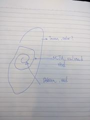
- Idea: Taiwan + NCTU + Debian
- Outer frame is Taiwan. Not sure which color can represent Taiwan? Green maybe?
- Middle circle is railroad from NCTU logo. The color shall be the same as NCTU logo (blue/purple).
- The inner whirl is Debian logo. The color is Debian red.
|
[DLange] Like the idea. Needs a computer drawing to be assessable.
|
|
|
- Idea: "Hundred pacer" is considered a god in some of indigenous cultures in Taiwan, which is good to be curled up as Debian logo.
- Color: Debian red #A80030.
- Possible DFSG violation due to related protection act. However the totem hasn't been registered to be protected, and in current status, nothing has been approved under the protection act.
- Possible to add a pit below the snake to resemble the restricted use logo.
|
[abdelq] I really like this one as it is. Not sure about the issues or what the modified version would look like.
[urbec] like the snake swirl
|
|
|
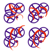
- Idea: Debian swirls shaped like NCTU gear logo.
- Color: NCTU purple #4b0080.
|
[lamby] I like the shape idea but only once it is explained to me, otherwise it is actually quite confusing.
[urbec] Like the idea of a gear-wheel like swirl, but the taiwan shape makes it look paperclippy.
|
|
|
- Idea: Chopsticks and bowl to symbolize the first DebConf in Asia. (Debian logo has been (mis)used in Taiwan beef noodles restaurants chain for their posters, to represent the smell.)
- In addition to the normal logo, we can have a dynamic logo concept with chopsticks, which is placed like holding a pair of it, with color in HSL: any hue, 100% saturation with 25-50% lightness.
|
[DLange] Another awesome logo idea. The tongue-in-cheek options with the logo on local posters could be quite a source of fun.
[lamby] Love this... although aren't chopsticks placed on the right of the bowl? :)
[abdelq] Nice logo, but the chopsticks on the side don't really fit in.
[seamlik] Swirl + chopsticks + bowl + number 18, can't love it more. But the chopsticks' position is indeed a little strange.
|
|
|
|
|
|
|
|
|
